

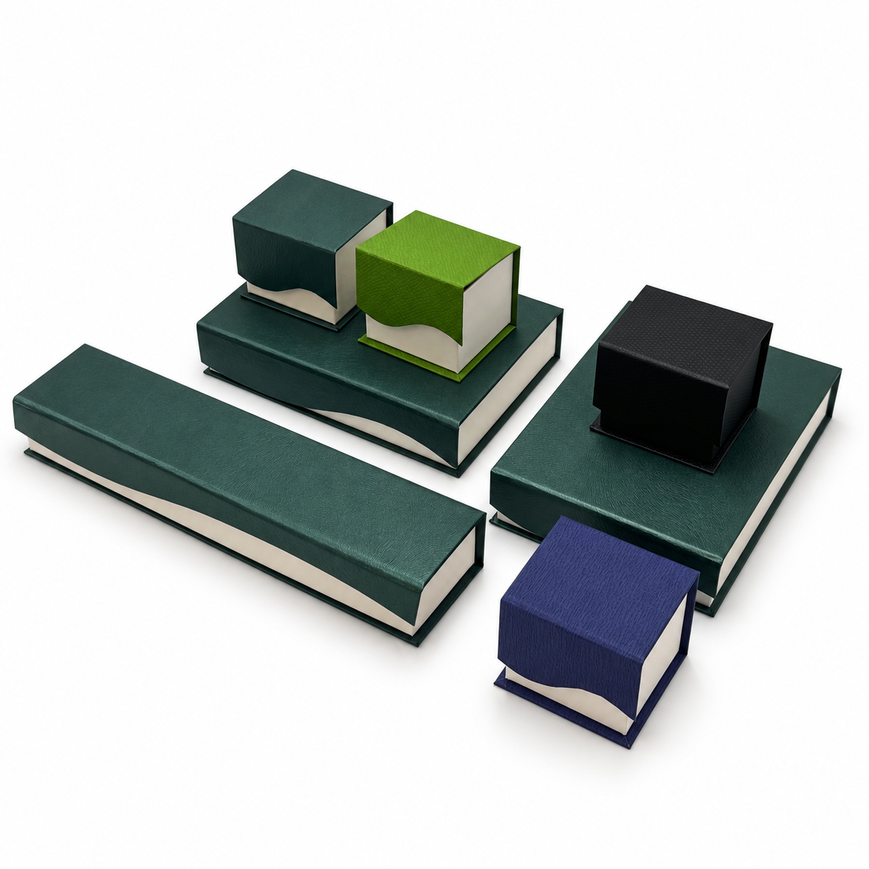
Pick the wrong box color and a ruby looks dull, a diamond loses its fire, and a jade bangle reads “souvenir” instead of “heirloom.” Box color is not decoration — it is the backdrop that either amplifies or flattens the stone inside.
B2B buyers usually arrive with one of two instincts: play it safe with saturated “luxury” colors (black, deep red, royal blue), or chase the Gen-Z momentum with Morandi muted tones. The truth is that the right answer depends on what jewelry goes inside. Here is a category-by-category breakdown from our color-matching experience across hundreds of custom jewelry box projects.
The Color Theory Behind the Box: Simultaneous Contrast
Two rules drive everything below:
- Value contrast — a light stone pops against a dark box; a dark stone needs a lighter or warmer neutral to avoid sinking into the backdrop.
- Hue contrast — placing a stone next to a similar hue mutes it (the box “eats” the stone); placing it near a complementary or neutral hue makes it sing.
With those rules in hand, let’s go category by category.
Diamonds & White Metals: Deep Saturated Wins — With One Modern Exception
Diamonds sell on brilliance. The fastest way to kill that brilliance is a light or dusty-toned box that matches the diamond’s value, flattening the contrast. Deep, saturated backdrops — black, midnight navy, emerald, burgundy — push the stone’s light return forward and photograph beautifully for e-commerce and social content.
- Best pairings: black velvet, royal blue suede, deep emerald velvet
- Morandi exception: if your brand targets younger, minimalist buyers, a dusty grey-blue or warm greige box shifts the story from “stone brilliance” to “quiet luxury” — a deliberate repositioning, not a mistake. Just expect the diamond to read softer, not sparklier.
Colored Gems (Ruby, Sapphire, Emerald): Avoid the Hue Collision
The most common custom packaging mistake we see is matching box color to stone color — a ruby in a red box, an emerald in a green box. Under simultaneous contrast, the stone and backdrop neutralize each other and both look cheap.
The professional approach is contrast or neutral framing:
- Ruby → deep charcoal, black, ivory; avoid reds and pinks
- Blue sapphire → warm ivory, champagne, cognac; navy only if the stone is very light
- Emerald → ivory, warm beige, black; avoid green
- Padparadscha & fancy stones → neutral taupe/greige lets the rare hue carry itself
For how interior materials (wood, microfiber) interact with colored stone saturation, see our dedicated guide on jewelry boxes for colored gems and jade.
Jade: Warm Neutrals and the Heritage Equation
Jade — especially the greens prized in Chinese and Asian markets — is a translucent stone that glows from within. It pairs best with warm, light neutrals: ivory, champagne, oyster, pale gold. These tones echo jade’s warmth without competing with its green.
Two market nuances:
- Heritage / traditional positioning: deep red and gold carry cultural weight for gifting occasions (weddings, Lunar New Year). Saturation here is a feature, not a cliché.
- Younger jade buyers: Morandi sage or dusty rose boxes reframe jade from “grandmother’s bangle” to “modern pastel accessory.” Our Morandi suede case study shows how these tones measurably lift Gen-Z purchase intent.
K-Gold (Yellow & Rose Gold): Warm on Warm — Carefully
Gold jewelry is warm-toned, so box color determines whether it reads “rich” or “brassy”:
- Yellow gold → deep saturated cools the tone beautifully: dark green, midnight navy, oxblood. The warm metal against a cool-deep backdrop reads expensive.
- Rose gold → warm Morandi is the natural match: dusty rose, terracotta, camel. A saturated red can tip rose gold toward pink-plastic; muted warm tones keep it sophisticated.
The Decision Matrix
| Jewelry Category | Saturated Luxury Pick | Morandi / Muted Pick | Avoid |
| Diamonds & platinum | Black, midnight navy, emerald | Dusty grey-blue (quiet-luxury brands) | White, pale pastels |
| Ruby | Charcoal, black, ivory | Warm greige | Red, pink |
| Blue sapphire | Champagne, cognac, black | Taupe | Light blue, navy (light stones) |
| Emerald | Ivory, black | Sage (young buyers) | Green |
| Jade | Deep red + gold (heritage gifting) | Morandi sage, dusty rose | Cool grey, neon tones |
| Yellow gold K-gold | Dark green, oxblood, navy | Camel | Bright yellow, orange |
| Rose gold K-gold | Deep burgundy | Dusty rose, terracotta | Saturated red, pink |
Saturated or Morandi? Ask Three Questions
- Who signs at the register? Heritage buyers and gifting occasions lean saturated; Gen-Z self-purchase leans Morandi.
- Where will photos live? E-commerce and social feeds favor deep saturated backdrops for contrast in thumbnails; boutique lookbooks favor muted tones.
- What’s inside? Let the stone category (rules above) override brand preference — the backdrop must serve the product.
For a deeper dive into how Morandi tones specifically drive younger conversions, read our Morandi suede jewelry box case study; for material-side color decisions, our guide on wood and microfiber linings for colored gems covers the interior.
Test the Pairing With Real Stones
Color renders differently on velvet, microfiber, PU leather and lacquer — and under retail lighting. We offer custom color matching (Pantone or physical swatch) and pre-production samples so you can validate the pairing with your actual products. Request samples and a quote, or explore our velvet jewelry box collections and emerald green velvet series for inspiration.
brp_mask:0;
brp_del_th:null;
brp_del_sen:null;
delta:null;
module: photo;hw-remosaic: false;touch: (-1.0, -1.0);sceneMode: 8;cct_value: 0;AI_Scene: (-1, -1);aec_lux: 0.0;aec_lux_index: 0;albedo: ;confidence: ;motionLevel: -1;weatherinfo: null;temperature: 42;
FAQ: Jewelry Box Color Pairing
What color jewelry box is best for diamond rings?
Deep saturated colors — black, midnight navy, emerald or burgundy velvet — create the strongest value contrast and push the diamond’s brilliance forward. Avoid white and pale pastel boxes, which match the diamond’s lightness and flatten the stone’s visual impact.
Should my jewelry box color match the gemstone color?
No. Matching box to stone (a ruby in a red box, an emerald in a green box) triggers simultaneous contrast: the two hues neutralize each other and both look cheaper. Use contrast framing instead — charcoal or ivory for ruby, ivory or black for emerald.
What color jewelry box suits jade?
Warm light neutrals such as ivory, champagne and pale gold complement jade’s inner glow without competing with its green. For traditional gifting markets, deep red with gold carries heritage value; for younger buyers, Morandi sage or dusty rose reframes jade as a modern accessory.
Do Morandi colors work for fine jewelry packaging?
Yes — but only as a deliberate brand position. Morandi tones shift the story from “stone brilliance” to quiet luxury and measurably lift Gen-Z purchase intent. Expect diamonds to read softer rather than sparklier; heritage buyers still respond better to saturated tones.
Can you custom-match a specific brand color (Pantone) on jewelry boxes?
Yes. Professional manufacturers offer Pantone matching or physical swatch matching across velvet, microfiber, PU leather and lacquer surfaces. Because color renders differently on each material, always request a pre-production sample on your actual chosen material before mass production.